As many of you know, Flutter has taken the cross-platform application development by a storm since its launch, and is one of the fastest accepted and growing technologies right now—everybody is talking about it in tech world!
So, you came to know about Flutter from your friend, colleague, some articles or some other way, and you decided to give it a shot. One of the first thing most of the Flutter developers might have learned is “Everything is a Widget.” Anything and everything you see on the screen is a widget.
And one of the most basic widget types is Layout widgets. Layout widgets are divided in 2 parts:
- Single child layout
- Multi child layout
The names do the most of the explaining about these categories. So, without further ado, let’s start with single child layout widgets.
Align
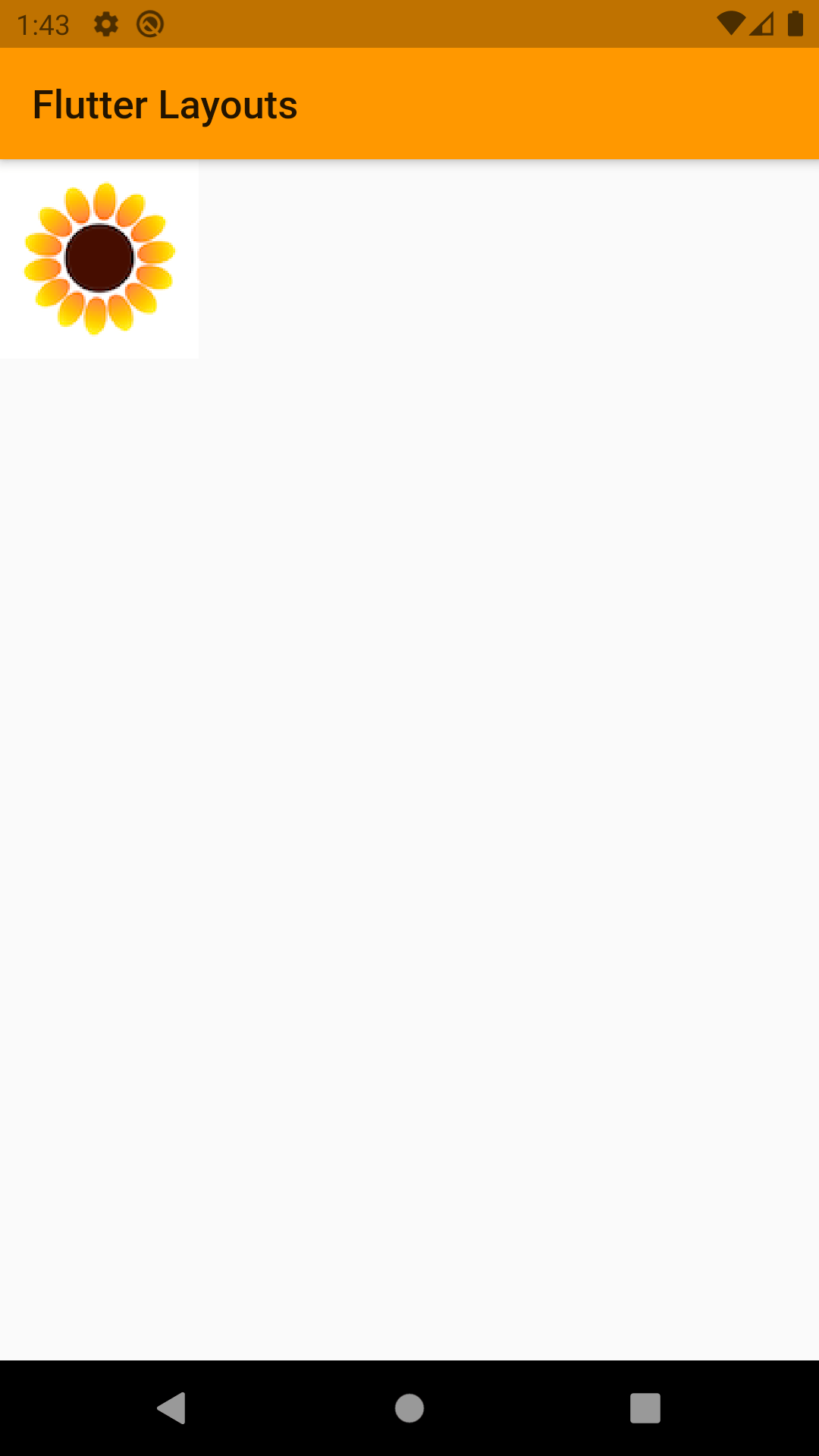
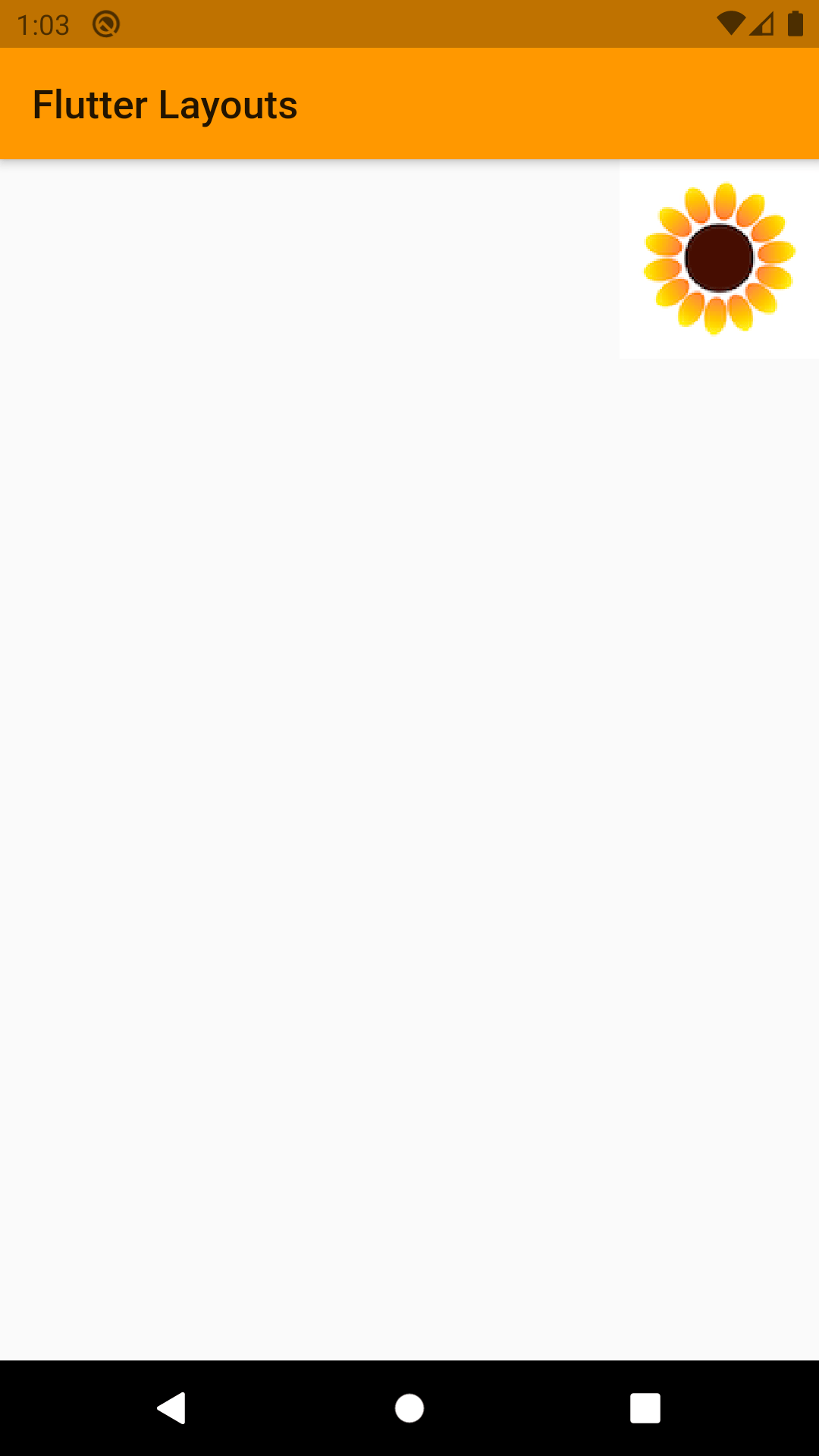
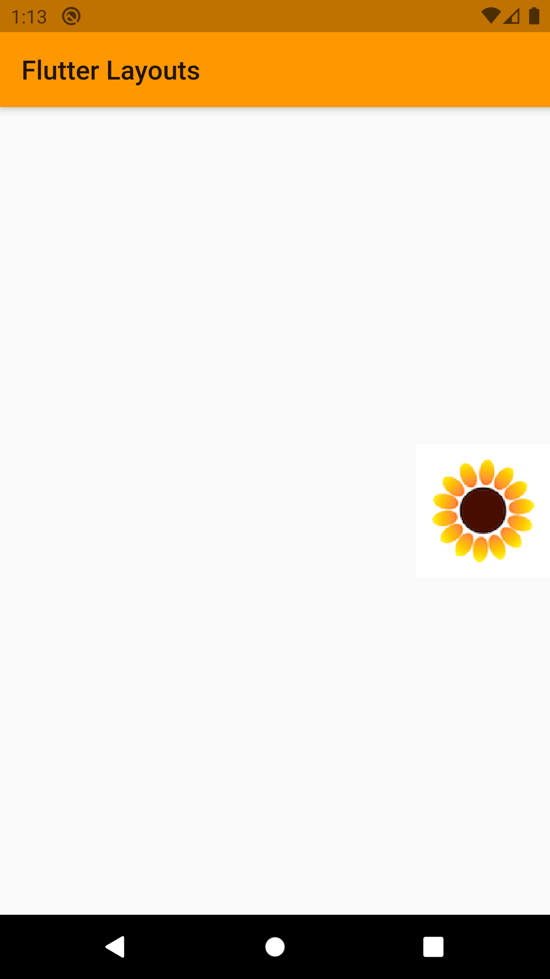
Align is a widget that aligns its child within itself and optionally sizes itself based on the child’s size. Align widget will wrap itself around the widget you desire to set on a fix location on the screen. Options that align widget give are shown below.
Properties
- child: any Widget
- heightFactor: sets its height to the child’s height multiplied by this factor
- widthFactor: sets its width to the child’s width multiplied by this factor
- alignment: this property decides where a widget will be rendered on the screen
There are 3 different ways you can use alignment property:
- Default properties provided by flutter. Which will render child widget on different part of the screen like top left, center, bottom center, bottom right etc.
- Define a single point in coordinate system where origin of the child widget should be placed. For an example:
alignment: Alignment (0.1, 0.8)
- Define one point of parent and one point of child. Flutter will place the child such that those two points will be on top of each other.
Most of the time we will be using default option given by the flutter to adjust our child widget on the screen.
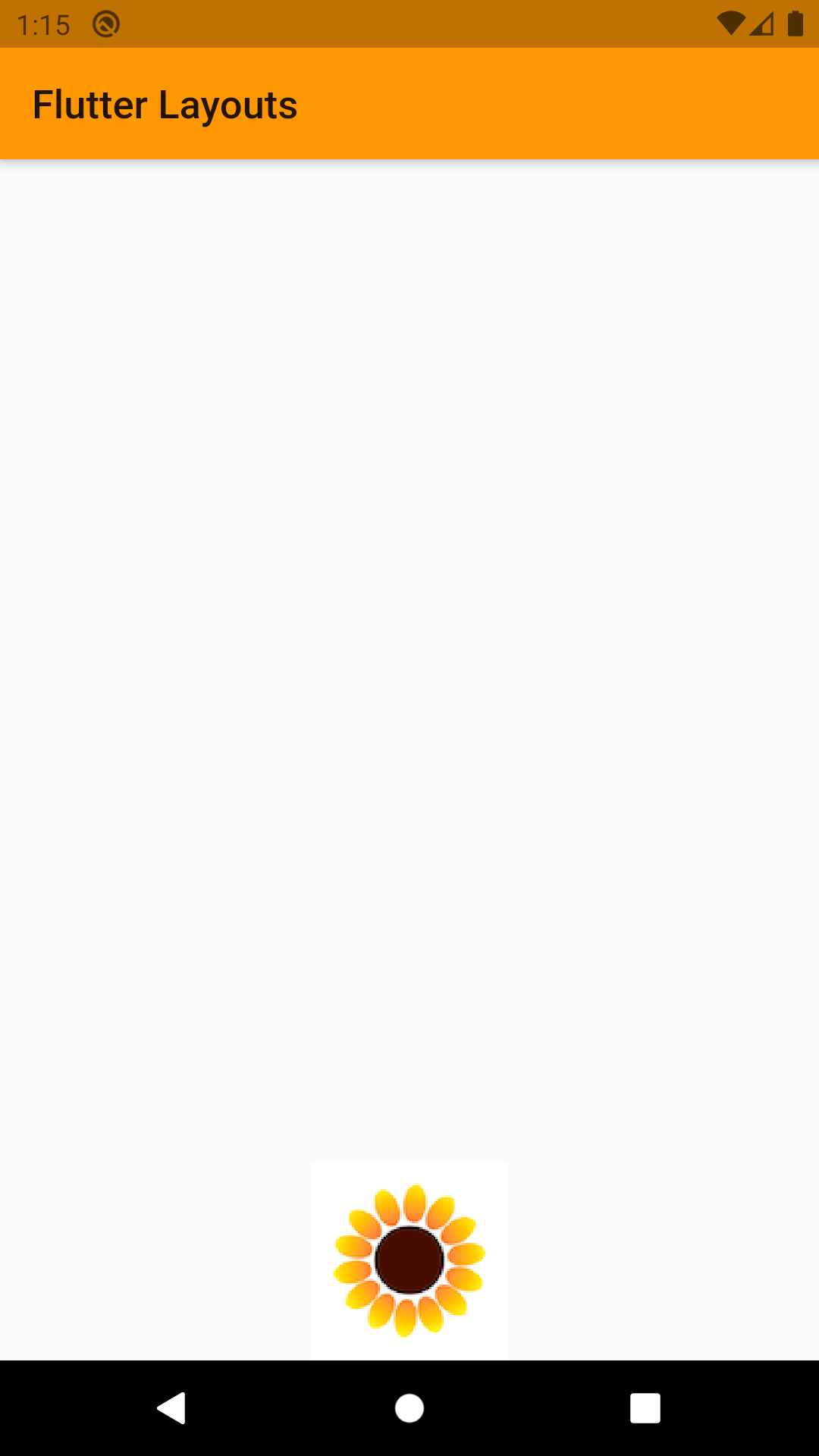
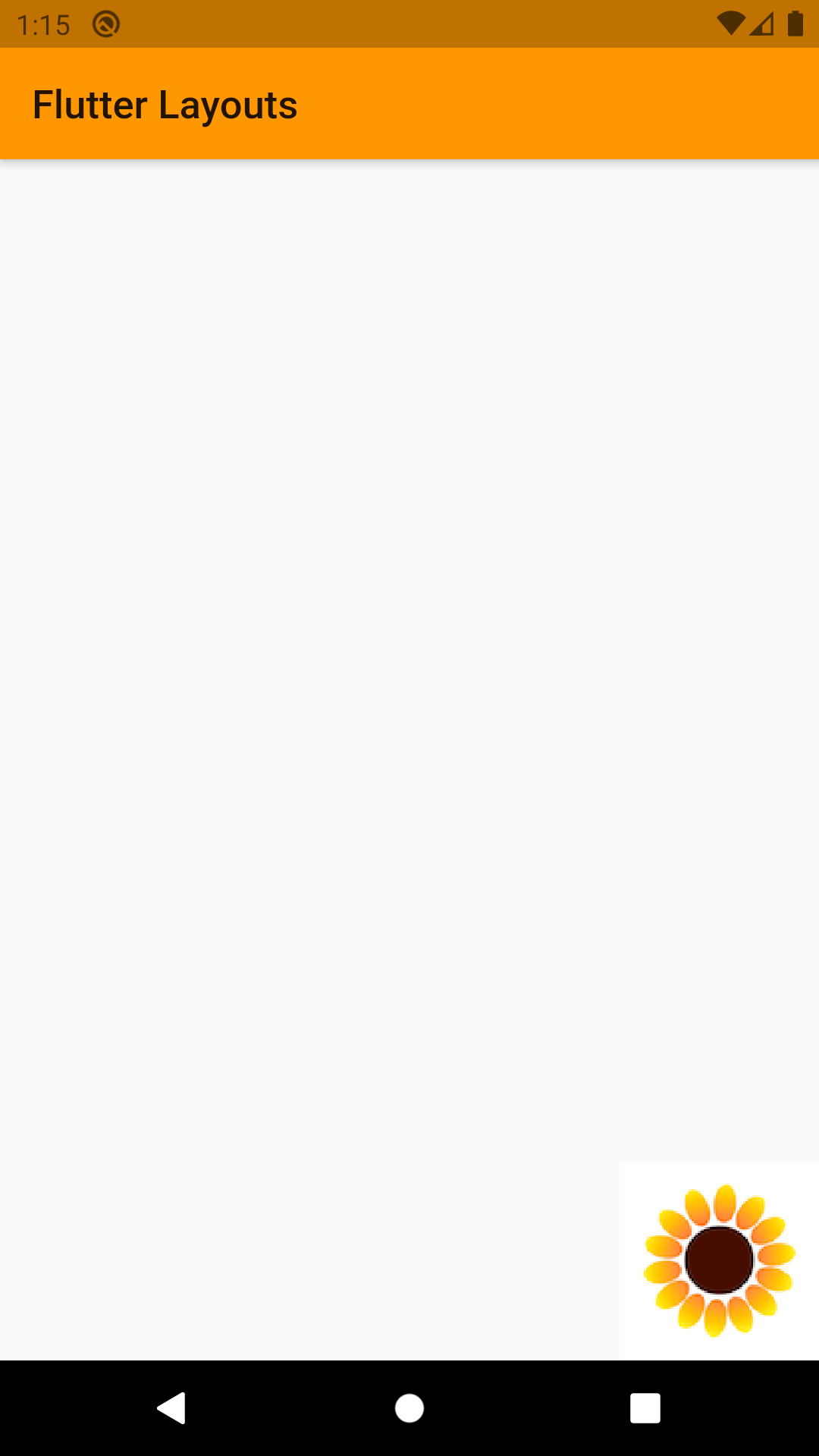
Here are few examples on how to use default alignment option provided by flutter:
Center
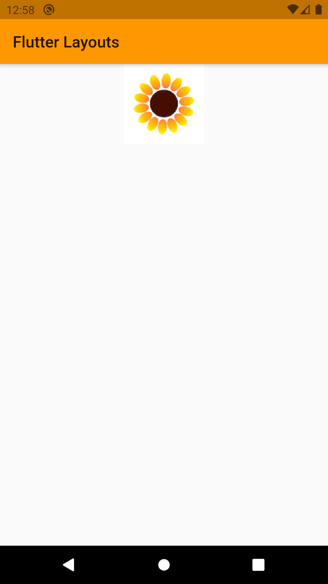
Center widget will starch itself to take as much space as possible and it will render its child widget in the center of itself. It is safe to say that Center is the mostly same as Align but with only one alignment that is center.
Properties
- child: Any widget.
Here is how Center will render its child Widget:
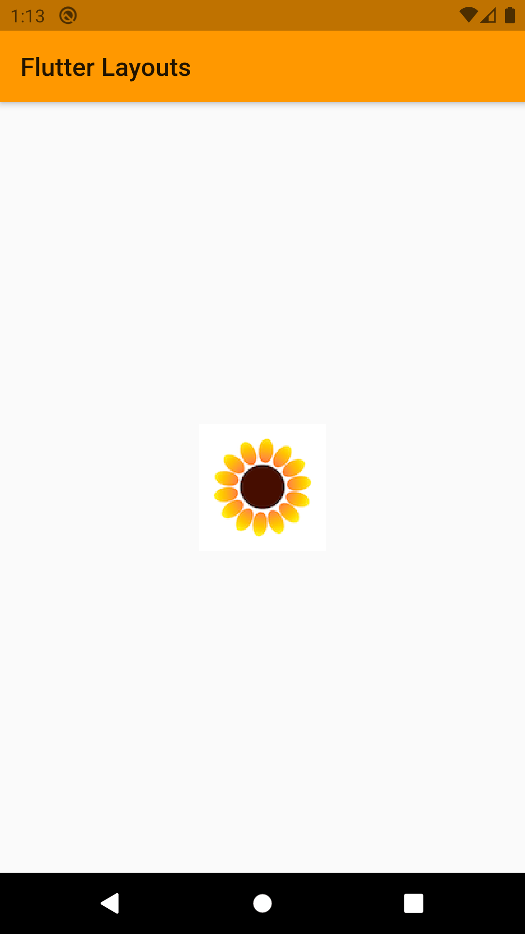

It is not possible to give height or width to center widget. It will always take all available space.
Container
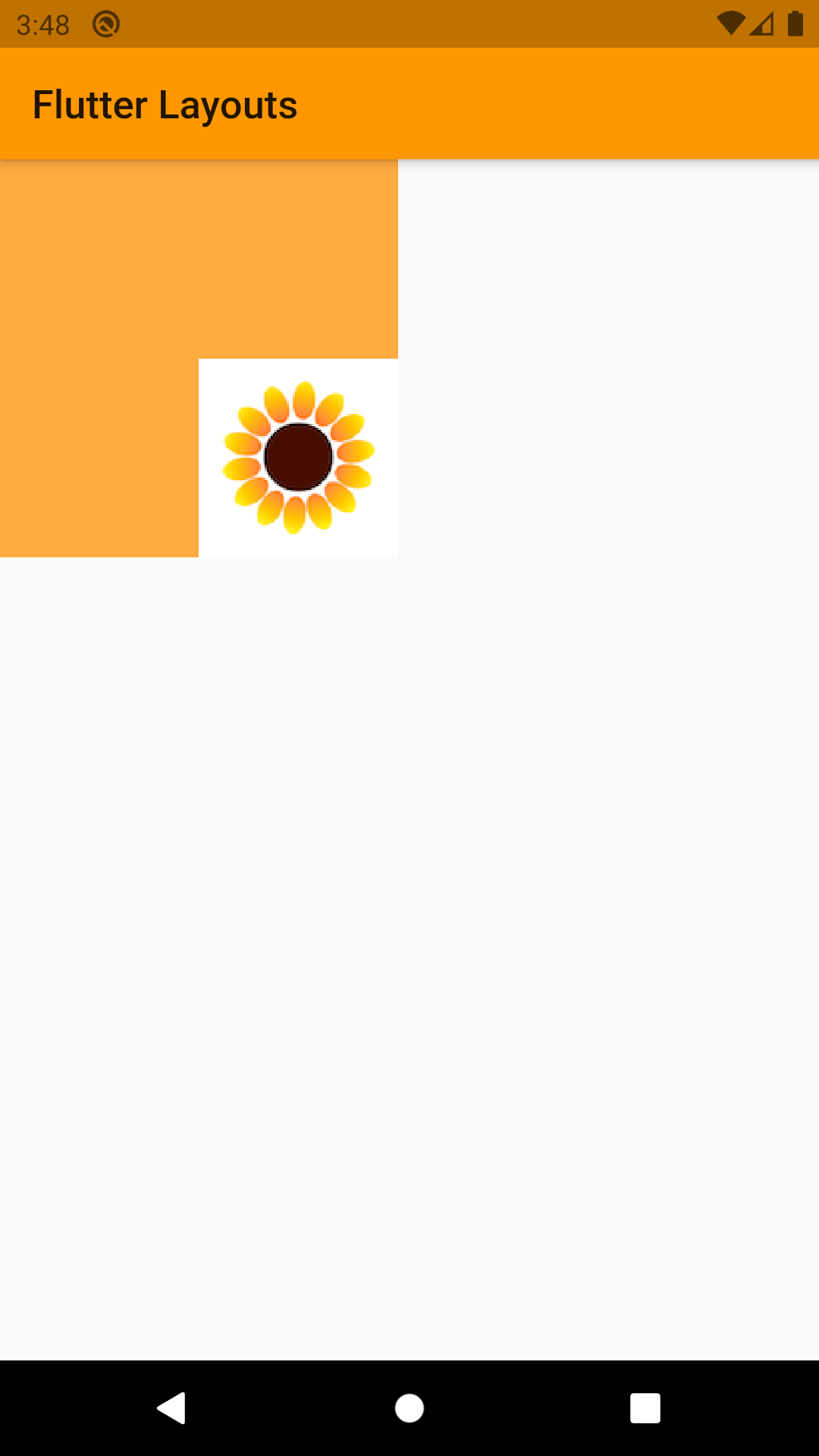
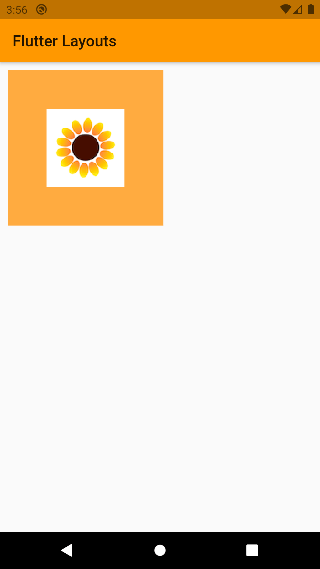
A Container can be used to store it child widget on the rendering tree, and then it can be position around the screen according to the requirement. In contras to Center widget it is possible to give the container height and width, but it is not possible to set its position on rendering screen like Align widget. But you can still set alignment for the child, which will determine where child would b placed inside the container.
Basically, a container is like a box that will store the contain but its size can be modified.
Properties
- child: Any Widget
- alignment: This property will decide where the child will be rendered inside the container
- color: It’s possible to give a color to the container. In above example orange is color given to the container
- height: Gives a fix height to container
- width: Gives fix width to container
- margin: Creates empty space around the container
- padding: Creates empty space inside the container
- decoration: Change how the container looks. This mainly used to give border to the container. Border width and color can be changed with this property

SizedBox
Sizedbox is basically the same as container but with a lot of limitation. Those limitation include, it is not possible to give margin, padding, color or decoration to sizedbox.
Sized box will automatically take size of its child, but if it is with no child and height and width null height and width will be taken as 0.
SizedOverflowBox
Most of the widget inn flutter takes size of its parents if not given and they cannot surpass it. A widget that is a specific size but passes its original constraints through to its child, which may then overflow.
Properties
- alignment: This property will decide where the child will be rendered inside the box.
- size: the size widget attempts to be.
Padding
Padding works same as padding in container. In fact, container uses Padding widget when padding property is used inside the container. So, if the only need is to add padding around the child Padding will do it much quicker in compare to using container and then use padding property.
Let’s talk!
We’d love to hear what you are working on. Drop us a note here and we’ll get back to you within 24 hours
Let’s talk!
We’d love to hear what you are working on. Drop us a note here andwe’ll get back to you within 24 hours
Related Posts
Databricks vs Snowflake vs Redshift
The workload type, financial concerns, and business use case all play a role in selecting Databricks, Snowflake, and Redshift as your cloud…
Agentic AI: Your Autonomous Ally
While traditional AI tools provide recommendations or analyze data, Agentic AI goes a step further, autonomously managing complex…
You might also like
Stay ahead in tech with Sunflower Lab’s curated blogs, sorted by technology type. From AI to Digital Products, explore cutting-edge developments in our insightful, categorized collection. Dive in and stay informed about the ever-evolving digital landscape with Sunflower Lab.


